Contrast - accessibility for web writers
Use colours that offer a sufficient contrast ratio between text and background colours, unless the text is decorative, incidental or part of a logo.
Benefits of using high contrast
People with low vision, age-related vision impairment or colour blindness can have problems reading text when there is not enough contrast between the text and background colours.
Stronger contrast might also help mobile device users when they're outside or in poor lighting conditions.
Text
If you publish content using templates that control text and background colours, you shouldn't have to worry about the contrast of your text. Your web designer or developer should have taken care of it.
Images of text
If you use images of text, you must check that the contrast is adequate—except if the text is part of a logo, or is decorative or incidental to the image.
The accessibility guidelines describe an image of text as:
"Text that has been rendered into a non-text form (e.g. an image) in order to achieve a particular visual effect. Note: This does not include text that is part of a picture that contains significant other visual content. Example: A person's name on a name tag in a photograph".
Take care to check that graphs, charts and maps with text legends, labels or captions offer sufficient contrast.
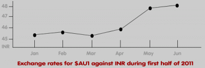
Information in maps, charts, graphs
The guidelines do not set contrast requirements for lines or data in maps, charts or graphs. However, if you want your graphical content to be accessible, we recommend ensuring you use sufficient contrast for these elements too.
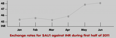
A line graph with data points that have poor colour contrast[/caption]
Contrast requirements
The accessibility guidelines set minimum and enhanced contrast requirements. In Australia, you must meet the minimum requirements.
Minimum contrast
Use a contrast ratio of 4.5:1, except for large text where you can use a contrast ratio of 3:1. Large text is defined as 18 points or 14 points bold.
To ensure your content is legible, for:
- Thin fonts, use a larger font size or higher contrast ratio
- Patterned backgrounds, use a higher contrast ratio
- Images of text created at 72 pixels per inch, use a text size of 24 points (or 19 points bold) if your contrast ratio is only 3:1
Enhanced contrast
If you are aiming for higher levels of accessibility (for level-AAA compliance with the Web Content Accessibility Guidelines), you will need to use a contrast ratio of 7:1, or 4.5:1 for large text.
Checking contrast
Several free tools let you check colour contrast. Two popular tools are:
- Colour Contrast Check: a web-based tool developed by Jonathan Snook
References
- Contrast (minimum) - understanding success criterion 1.4.3
- Contrast (enhanced) - understanding success criterion 1.4.6
- Web Content Accessibility Guidelines 2.0
Next article in this series
Learn web content accessibility
Make sure a broad audience can use your content. Our course teaches how to create content that meets WCAG 2.1 guidelines.
Book a course at https://4syllables.com.au/