Long descriptions for images - part 2
Long descriptions are text alternatives for complex or detailed images. In this article we look at some examples: charts and graphs, maps and plans, infographics, diagrams and technical drawings.
Before writing a text alternative for any graphic, you should consider:
- what the graphic communicates to sighted users. Focus on communicating equivalent information or ideas in your text alternative.
- whether any of the information communicated in the graphic is already included in the text on the page. You don't need to repeat this.
- the level of detail you need to communicate your intended message to your target audience.
Charts and graphs
Charts and graphs are visual representations of data. Line and bar graphs, scattergrams, pie charts and similar graphics help us make sense of complex numerical information. They allow us to see the relationships and trends in data.
To provide a suitable long description, you should:
- identify the type of graph or chart (unless you've done this in the ALT text)
- provide a summary of the data, explaining the trends that a sighted person can see in the image
- include a table with the detailed data used in the graphic.
Charts and graphs example - line graph
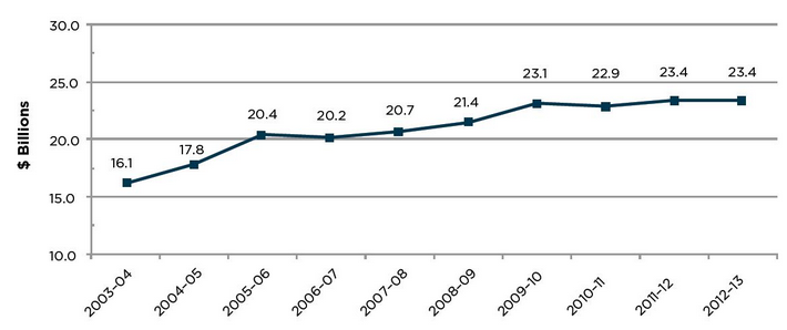
Pharmaceutical industry turnover in Australia - text version (heading level 1 - assuming it's on its own page) Turnover has risen in the ten years since 2003-04. The biggest increases were in 2005-06 and 2009-10, but these were followed immediately by slight decreases (in 2006-07 and 2010-11), the only times turnover fell. Turnover has been steady at $23.4 billion for the past two financial years.
| Financial year | Turnover ($ billions) |
|---|---|
| 2003-04 | 16.1 |
| 2004-05 | 17.8 |
| 2005-06 | 20.4 |
| 2006-07 | 20.2 |
| 2007-08 | 20.7 |
| 2008-09 | 21.4 |
| 2009-10 | 23.1 |
| 2010-11 | 22.9 |
| 2011-12 | 23.4 |
| 2012-13 | 23.4 |
Diagrams
Diagrams are visual representations of the relationships or connections between people, things, activities and ideas. Organisational charts, flowcharts, decision trees and other diagrams provide an overview of a hierarchy, flow, set of choices or system. They can help us see complex processes at a glance.
To provide a suitable long description you should:
- identify the type of diagram (unless you've done this in the ALT text)
- provide a summary of the high-level information that a sighted person can see in the diagram
- include a text description detailing the hierarchy, steps, decisions and outcomes, or nodes and connections.
Diagram example - organisational chart
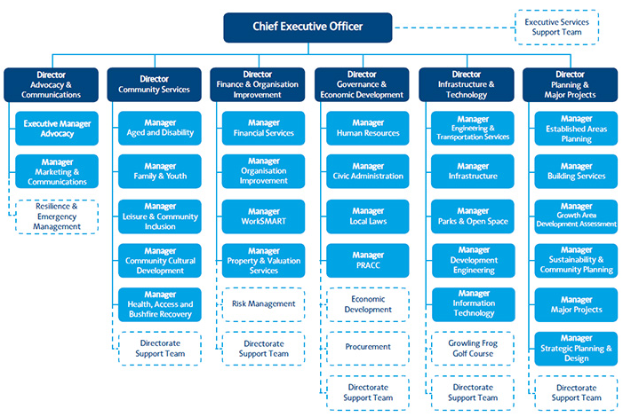
Source: City of Whittlesea.
- Director, Advocacy and communications
- Executive Manager Advocacy
- Manager Marketing and Communications
- Resilience and Emergency Management
- Director, Community Services
- Manager Aged and Disability
- Manager Family and Youth
- Manager Leisure and Community Inclusion
- Manager Community Cultural Development
- Manager Health, Access and Bushfire Recovery
- Director, Finance and Organisation Improvement
- Manager Financial Services
- Manager Organisation Improvement
- Manager Organisation Planning
- Manager Property and Valuation Services
- Risk Management
- Director, Governance and Economic Development
- Manager Human Resources
- Manager Civic Administration
- Manager Local Laws
- Manager Plenty Ranges Arts and Convention Centre
- Economic Development
- Procurement
- Director, Infrastructure and Technology
- Manager Engineering and Transportation Services
- Manager Infrastructure
- Manager Parks and Open Space
- Manager Development Engineering
- Manager Information Technology
- Growling Frog Golf Course
- Director, Planning and Major Projects
- Manager Established Areas Planning
- Manager Building Services
- Manager Growth Areas Development Assessment
- Manager Sustainability and Community Planning
- Manager Major Projects
- Manager Strategic Planning and Design
Infographics
Infographics are visual representations of information or data. They're usually less technical and more visually appealing than standard graphs, charts or diagrams.
To provide a suitable long description you should:
- write a text version of the information conveyed visually
- include all textual information from the graphic
- organise the information in an order that makes sense when read aloud
- use any necessary headings, lists or tables to structure the information.
Infographic example
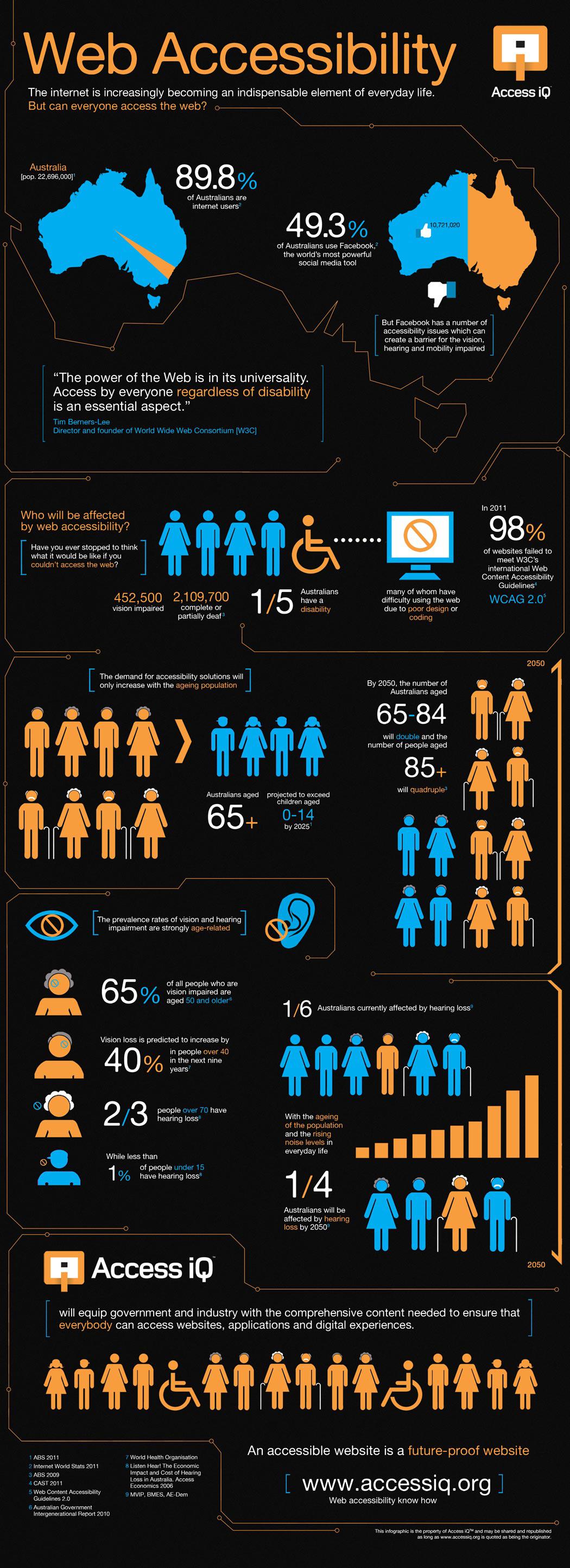
Source: Access IQ
Web accessibility infographic - text version (heading level 1 - assuming it's on its own page) The internet is increasingly becoming an indispensable element of everyday life. Director and founder of the World Wide Web Consortium (W3C), Tim Berners-Lee once said: "The power of the web is in its universality. Access by everyone regardless of disability is an essential aspect." But can everyone access the web? Australia has a population of 22,696,000 [ABS 2011] and 89.8 per cent of Australians are internet users [Internet World Stats 2011]. 10,721,020 Australians use Facebook, the world's most powerful social media tool. That's 49.3 per cent of Australia's population [Internet World Stats 2011]. But Facebook has a number of accessibility issues which can create a barrier for the vision, hearing and mobility impaired.
Who will be affected by web accessibility? (heading level 2) Have you ever stopped to think what it would be like if you couldn't access the web? 452,500 Australians are vision impaired and 2,109,700 are completely or partially deaf [ABS 2009]. One in five Australians have a disability, many of whom have difficulty using the web due to poor design or coding. In 2011, 98 per cent [CAST 2011] of websites failed to meet the W3C's international Web Content Accessibility Guidelines (WCAG 2.0).
The demand for accessibility solutions will only increase with Australia's ageing population (heading level 2) The number of Australians aged 65 and older is projected to exceed the number of children aged 0-14 by 2025 [ABS 2011]. By 2050, the number of Australians aged 65 – 84 will double and the number of people over 85 will quadruple [ABS 2009]. The prevalence rates of vision and hearing impairment are strongly age-related.
- 65 per cent of all people who are vision impaired are aged 50 and older [Australian Government Intergenerational Report 2010]
- Vision loss is predicted to increase by 40 per cent in people over the age of 40 in the next nine years [World Health Organisation]
- Two out of three people over 70 have hearing loss [Listen Hear! The Economic Impact and Cost of Hearing Loss in Australia. Access Economics 2006]
- Less than one per cent of people under 15 have hearing loss [Listen Hear! The Economic Impact and Cost of Hearing Loss in Australia. Access Economics 2006]
One out of six Australians is currently affected by hearing loss [MVIP, BMES, AE-Dem]. With the ageing of the population and the rising noise levels in everyday life, one in four Australians will be affected by hearing loss by 2050. [MVIP, BMES, AE-Dem].
Access iQ (heading level 2) We will equip government and industry with the comprehensive content needed to ensure that everybody can access websites, applications and digital experiences. An accessible web is a future-proof website. Visit www.accessiq.org for web accessibility know how.
Technical drawings
Technical drawings are visual representations of scientific, engineering or architectural information. They can be 2 or 3-dimensional and some are very detailed.
To provide a suitable long description you should:
- identify the type of drawing (unless you've done this in the ALT text)
- provide a summary of the high-level information that a sighted person can see from the drawing
- include a text description detailing the elements shown in the drawings.
Technical drawing example - (historical)
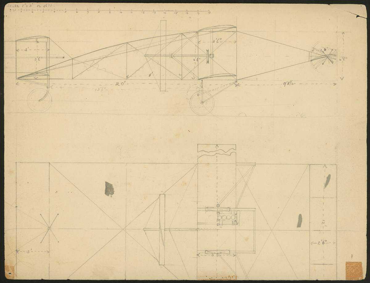
Source: Museum Victoria (Describe Me project)
Plan for biplane design by John R Duigan, 1909 - text version (heading level 1 - assuming it's on its own page)
The drawing shows a side elevation on the top half of the sheet and a plan of the aircraft below. It is drawn to a scale of 1 inch = 3 feet (1:36).
The aircraft is a single-propeller pusher-type biplane with a four-cylinder, vertical in-line engine on the left of centre over the main wings. It has:
- a 12 feet x 2.5 feet (3660 mm x 760 mm) forward elevator
- twin 12 feet x 3 feet (3660 mm x 915 mm) rear tailplains above and below a moveable vertical rudder
- twin main wheels mounted on pivoting arms with shock-absorbers under the main wing and a single fixed tail wheel under the tailplain.
The aircraft has an overall length of 29.5 feet (8990 mm) and a wingspan of 20 feet (6100 mm).
Drawn in grey-lead pencil on a buff-coloured sheet of card cut from a manilla folder.
Maps and plans
Maps and plans are visual representations of spatial information. They can show features, facilities, routes and data overlayed on a geographical area or within a building.
To provide a suitable long description you should:
- identify the type of map or plan (unless you've done this in the ALT text)
- provide an overview of the main features, or a summary of the trends if the map shows data
- detail the information shown on the map or plan, or include a data table if the map shows data
- organise the information in an order that makes sense when read aloud
- use any necessary headings, lists or tables to structure the information.
Maps example - floor plan
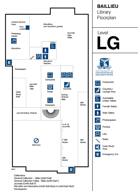
Source: University of Melbourne
Click for larger version[/caption] Baillieu Library lower ground level floorplan- text version (heading level 1 - assuming it's on its own page) Collections (heading level 2)
- General collection - 900s (UniM Bail)
- General collection folios - 900s (UniM Bail f)
- Journals (UniM Bail P)
- Microfilm and Microfiche (UniM Bail Mic/o & UniM Bial Mic/f)
- Newspapers
Facilities (heading level 2)
- Computers
- Printers
- Photocopy centre
- Unicard Service Point
- Auto loader
- Quiet study area
- Couches
- Male, female and unisex disabled toilets (beside the lift)
Three lifts and a stairwell provide access to this floor. The emergency exit is to the right and straight ahead as you leave the stairwell.
Related articles
These articles also include examples of long descriptions for images.
Web writing course
Learn how to write and design content that's easy to find, read, and use.
We run live online training for individuals and groups.
Book a course at https://4syllables.com.au/