Exercise 5: Create accessible content
Use the checklist for creating accessible content.
Part 1: Text alternatives
What text alternative should you provide for the highlighted images in the examples
below?
Example 1
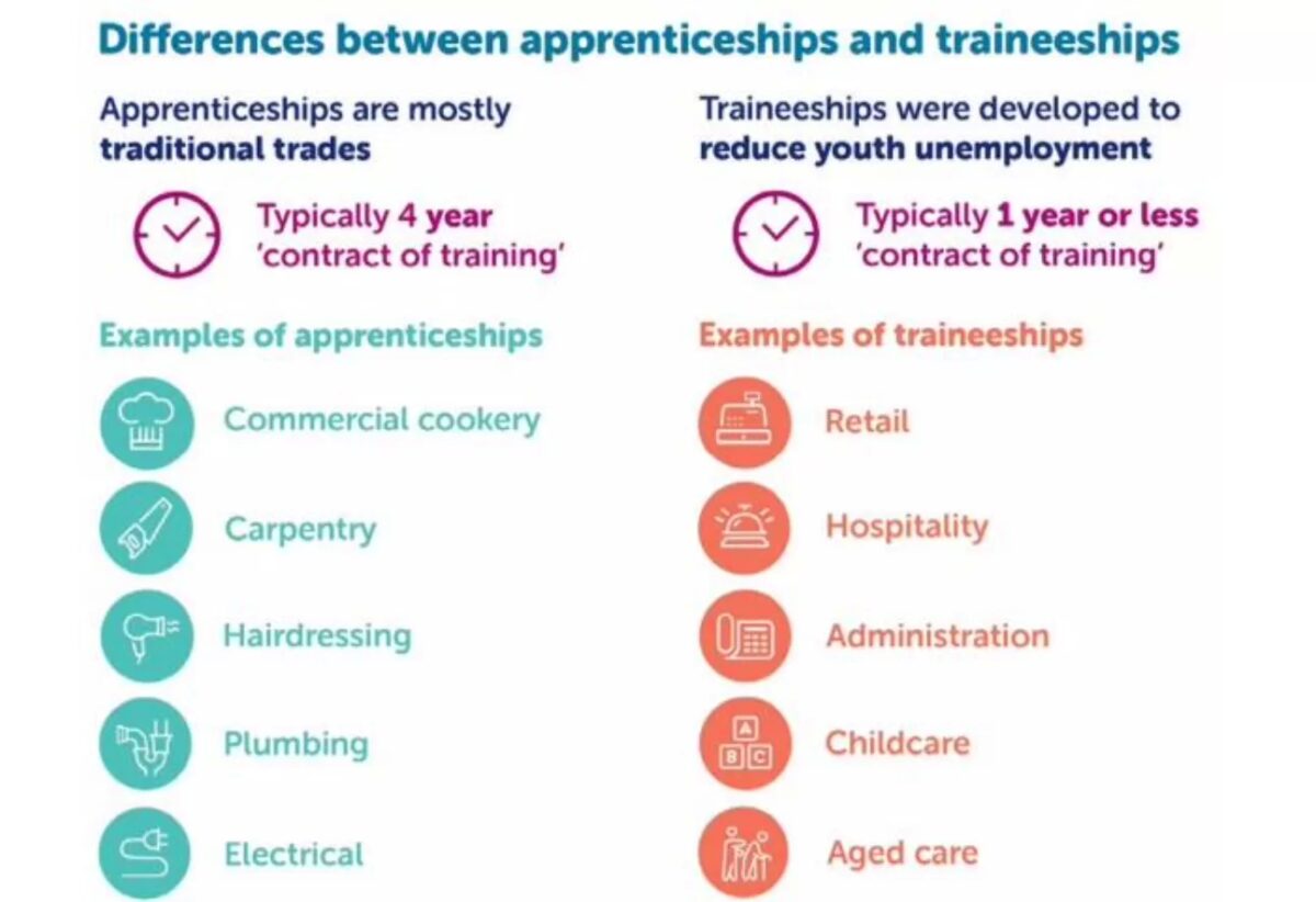
Example 2
Part 2: Colour and contrast
What colour or contrast issues need to be checked or resolved to make these images accessible?
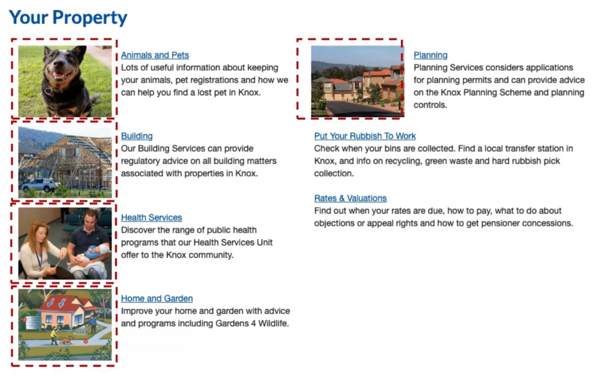
Example 1

Example 2
Part 3: Review for accessibility
What would it take to make these images accessible?
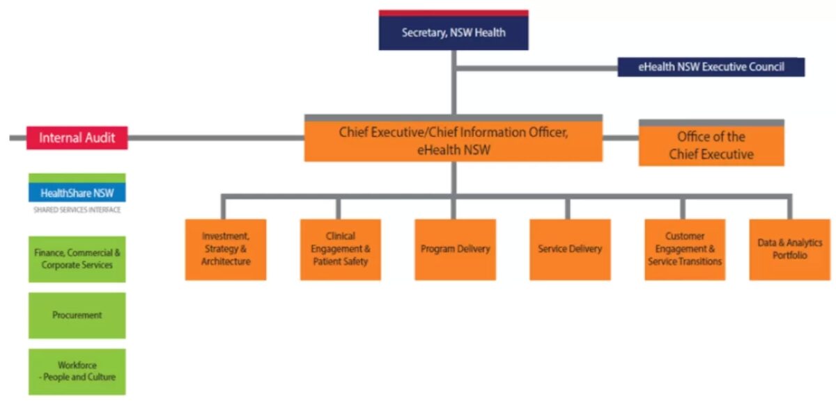
Example 1
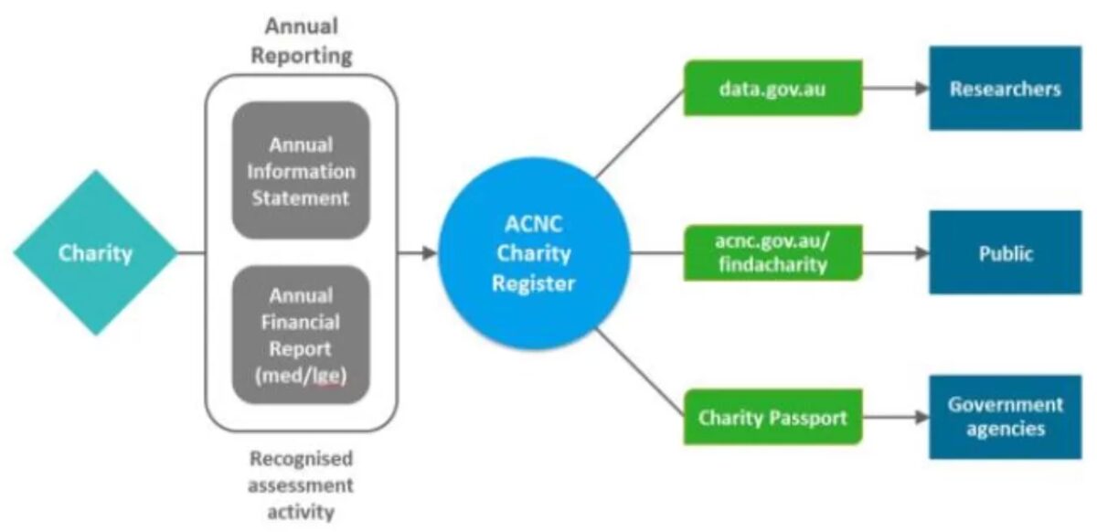
Example 2